Monthly Archives: July 2010

Using chron() dates in axes and converting between “excel” time!

In the last post, I demonstrated how to produce a matrix plot in R. As I mentioned before, I have used matrix plots to display data that was chronologically ordered. When I first started using time series data, one of the major hurdles to plotting was getting date labels looking right and also getting them in the right location. Here I’ll show you my method for using date labels on either axis of a x-y plot. As usual, I find the R help forums very using for times when I am stumped. There are some excellent tips, examples and discussions about everything to do with R. I will use a simple example with random data points, and plot dates on the x-axis. Also, if you look carefully, you’ll see a method for converting between MS excel time and the time format from the “chron” pacakage. I also added a few tweeks I like to use to “spruce up” my figures:

– Have axis tick mark inside plot region
– Use mtext() to plot axis labels
– Add grid to background for easier viewing.

# Plotting parameters
par(font = 2, mar=c(5.5, 4, 3, 4) + 0.1)

# Create chron object (dates) from excel times
library(chron)
excel.dates <- seq(40179, 40205, 1) #time in MS excel (1/1/2010 to 1/27/10)
orig <- chron(&quot;12/30/1899&quot;)
date <- orig + excel.dates;

# Y data
y.dat <- rnorm(27, 10, 3)

# Plot it up!  Don't add annotations or axes for now
plot(date, y.dat, type="n", ann=F, axes=F)
# Add grid to background of plot
abline(h = seq(0, max(y.dat)+4, 2), col = "grey90", lty=  3)
abline(v = c(seq(date[1], date[length(date)],2)), col = "grey90", lty=  3)
# Add data
lines(date, y.dat, lwd = 2, col = "black")
points(date, y.dat, pch = 20, col = "magenta")
box()  # add box around plot

# Add X-Axis and label
axis.Date(1,date,format="%m/%d/%y", labels = F,
	at=c(seq(date[1], date[length(date)],2)), tck = +0.01)
label=c(seq(date[1], date[length(date)],2))
x.len=length(label)
text(x=label[1:x.len],  par("usr")[3]-.235, srt = 45, adj = 1,
          labels = label, xpd = T)
mtext(side = 1, "Time", line = 3.2)  #X-axis label

# Add Y-axis and label
axis(2, at =seq(0, max(y.dat)+4, 2), las = 2, tck = +0.01)
mtext(side = 2, "Y Var", line = 3.0)  #Y-axis label
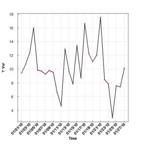
x-y plot with date along x-axis

Matrix plots in R: a neat way to display three variables

I’ve decided to share a neat way of plotting data; something I’ve used a number of times for my own projects. There may already be R packages out there which have functions to produce matrix plots, but it never hurts to know how to use base R plotting functions to get the job done.
In a nutshell a matrix plot lets you display three variables on a x-y axis: the x and y axis form a “grid” and each “cell” of the grid is colored based on the magnitude of a third variable. In the past, I’ve used a matrix plot with a time series of correlation coefficients. The y-axis was dates, the x-axis was different independent variables, and the color of each “cell” was the magnitude of correlation. Maybe my next post will demonstrate how to plot dates on the the y or x-axis. Also, feel free to mess around with rgb() function to learn how it changes the color scheme!

### Create Matrix plot using colors to fill grid
# Create matrix.   Using random values for this example.
rand <- rnorm(286, 0.8, 0.3)
mat <- matrix(rand, nrow = 26)
dim(mat)  # Check dimensions

# Create x and y labels
yLabels <- seq(1, 26, 1)
xLabels <- c("a", "b", "c", "d", "e", "f", "g", "h", "i",
"j", "k");

# Set min and max values of rand
 min <- min(rand, na.rm=T)
 max <- max(rand, na.rm=T)

# Red and green range from 0 to 1 while Blue ranges from 1 to 0
 ColorRamp <- rgb(seq(0.95,0.99,length=50),  # Red
                  seq(0.95,0.05,length=50),  # Green
                  seq(0.95,0.05,length=50))  # Blue
 ColorLevels <- seq(min, max, length=length(ColorRamp))

# Set layout.  We are going to include a colorbar next to plot.
layout(matrix(data=c(1,2), nrow=1, ncol=2), widths=c(4,1),
         heights=c(1,1))
#plotting margins.  These seem to work well for me.
par(mar = c(5,5,2.5,1), font = 2)

# Plot it up!
image(1:ncol(mat), 1:nrow(mat), t(mat),
	 col=ColorRamp, xlab="Variable", ylab="Time",
	 axes=FALSE, zlim=c(min,max),
	 main= NA)

# Now annotate the plot
box()
axis(side = 1, at=seq(1,length(xLabels),1), labels=xLabels,
      cex.axis=1.0)
axis(side = 2, at=seq(1,length(yLabels),1), labels=yLabels, las= 1,
      cex.axis=1)

# Add colorbar to second plot region
par(mar = c(3,2.5,2.5,2))
 image(1, ColorLevels,
      matrix(data=ColorLevels, ncol=length(ColorLevels),nrow=1),
      col=ColorRamp,xlab="",ylab="",xaxt="n", las = 1)

Matrix Plot (color Bar represents third variable)